
Flexi-Grid Layout for Experience Cloud (LWR) Documentation
Flexi-Grid Layout for Experience Cloud (LWR)
As of: Winter '25
Authored By: George Abboud
Last Updated: 10/10/2024
Description
The Flexi-Grid Layout component for Experience Cloud LWR brings you the ability to create amazing modern designs by allowing you to render and control up to 12 regions of content, and drag/drop any component from your panel in builder into them. Configure the number of regions you want on a row, their sizes per the 12-column SLDS grid system, and stacking behavior on different form factors. Take your design to the next level with the ability to pass custom CSS classes and fully control the look and feel of your content regions!
Disclaimer:
This package is free to use, but is not an official salesforce.com product, and should be considered a community project. The functionality is not officially tested or documented, and does not come with any support, warrantees, or updates. It is offered as-is.
AppExchange Listing URL
https://appexchange.salesforce.com/listingDetail?listingId=a0N4V00000Gv1psUAB
Open-Source Code
https://github.com/salesforce-experiencecloud/FlexiGridLayout
Usage and Configuration
Using this component is pretty easy! Just follow these steps:
Install the package in your org
Access Experience Builder for the LWR site that you want to use this component in.
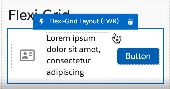
Open the components panel, and you should see a component called “Flexi-Grid Layout (LWR)” - drag/drop that onto your page
That’s it! Drag standard and custom components into the regions to build out the grid layout of your choice!
Usage Tips
Control the sizing of regions by form factor. You may want a different sizes for a region for different form factors to achieve responsive design, and you can now do this with Flexi-Grid Layout!
This component is built on the Salesforce Lightning Design System Grid. This utilizes region widths of 12, meaning all region width units in a row should add up to 12 when setting your region sizing. Once the regions add up to 12 columns, they will wrap to the next row for the next 12, and so on. The exception to this is when “Fit Content” or “Available Space” are used in an instance of the component, then there is no wrapping and for another row you will need another instance of the component.For example, to achieve the design below, let’s assume we have 3 regions: Astro, Codey, Cloudy from left to right. You would set Astro and Cloudy to “Fit Content” and Codey to “Available Space”. This would keep the icon and the button regions the same size as their content, while the text stretches based on how much space it has as the window size changes.
Control the order of regions by form factor. Like in a header, you may want the logo region to be the first on desktop, but the last on tablet or mobile. You can now do this with one instance of a component and no customization or css.
Control the horizontal alignment by region, or the vertical alignment for the entire component based on form factor.
The CSS Classnames property can be set to add region gutters such as ‘slds-gutters_small slds-p-vertical_medium’. This would add spacing between the regions above and below the grid. (see sections ‘Region Gutters’ and ‘Grid Padding’ below).
Review the ‘CSS Selectors’ section below to learn how to style with your own CSS
Quickly copy one form factor’s configuration into another instead of manually mirroring it.
Export / Import the entire configuration from one instance of the component to another, whether that’s in the same org, same site or different.

CSS Selectors
To target the Grid Class, add your own class name to the CSS Classes property. Then the specific regions can be targeted in the following format: region-[regionName]
For Example, if I add “customClass” to the CSS Classes property, I can target that component’s regions as follows:
.customClass .region-SaaSy,
.customClass .region-Astro {
padding-top: 15px;
padding-bottom: 15px;
}